VitePress
介绍
VitePress 是一个静态站点生成器 (SSG),专为构建快速、以内容为中心的站点而设计。简而言之,VitePress 获取用 Markdown 编写的内容,对其应用主题,并生成可以轻松部署到任何地方的静态 HTML 页面。
和 VuePress 区别
VitePress 灵感来源于 VuePress。最初的 VuePress 基于 Vue 2 和 webpack。借助 Vue 3 和 Vite,VitePress 提供了更好的开发体验、更好的生产性能、更精美的默认主题和更灵活的自定义 API。
VitePress 和 VuePress 之间的 API 区别主要在于主题和自定义。如果使用的是带有默认主题的 VuePress 1,迁移到 VitePress 应该相对简单。
VuePress 2 我们也投入了精力,它也支持 Vue 3 和 Vite,与 VuePress 1 的兼容性更好。但是,并行维护两个 SSG 是难以持续的,因此 Vue 团队决定将重点放在 VitePress,作为长期的主要 SSG 选择推荐。
创建项目
查看 node 版本
$ node --version
v20.12.2
创建一个空目录
mkdir test
cd test
为现有项目添加 vite 依赖
npm install -D vitepress --registry=https://registry.npmmirror.comVitePress 附带一个命令行设置向导,可以帮助你构建一个基本项目。安装后,通过运行以下命令启动向导:
npx vitepress init将需要回答几个简单的问题:
Need to install the following packages:
  [email protected]
Ok to proceed? (y) y

┌  Welcome to VitePress!
│
◇  Where should VitePress initialize the config?
│  ./docs
│
◇  Site title:
│  My Awesome Project
│
◇  Site description:
│  A VitePress Site
│
◇  Theme:
│  Default Theme
│
◇  Use TypeScript for config and theme files?
│  Yes
│
◇  Add VitePress npm scripts to package.json?
│  Yes
│
└  Done! Now run npm run docs:dev and start writing.
启动项目
npm run docs:dev访问 http://localhost:5173/ 打开 VitePress。
导航栏
导航链接
可以定义 themeConfig.nav 选项以将链接添加到导航栏。
export default {
  themeConfig: {
    nav: [
      { text: 'Guide', link: '/guide' },
      { text: 'Config', link: '/config' },
      { text: 'Changelog', link: 'https://github.com/...' }
    ]
  }
}
text 是 nav 中显示的实际文本,而 link 是单击文本时将导航到的链接。对于链接,将路径设置为不带 .md 后缀的实际文件,并且始终以 / 开头。
导航链接也可以是下拉菜单。为此,请替换 link 选项,设置 items 数组。
export default {
  themeConfig: {
    nav: [
      { text: 'Guide', link: '/guide' },
      {
        text: 'Dropdown Menu',
        items: [
          { text: 'Item A', link: '/item-1' },
          { text: 'Item B', link: '/item-2' },
          { text: 'Item C', link: '/item-3' }
        ]
      }
    ]
  }
}
请注意,下拉菜单标题 (上例中的 Dropdown Menu) 不能具有 link 属性,因为它是打开下拉对话框的按钮。
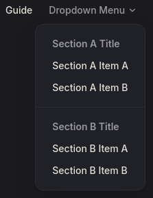
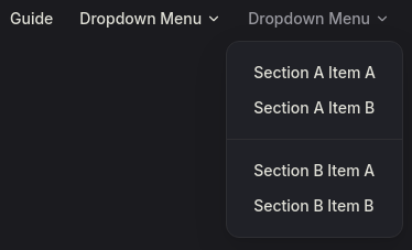
还可以通过传入更多嵌套项来进一步向下拉菜单项添加“sections”。
export default {
  themeConfig: {
    nav: [
      { text: 'Guide', link: '/guide' },
      {
        text: 'Dropdown Menu',
        items: [
          {
            // 该部分的标题
            text: 'Section A Title',
            items: [
              { text: 'Section A Item A', link: '...' },
              { text: 'Section A Item B', link: '...' }
            ]
          },
          {
            // 该部分的标题
            text: 'Section B Title',
            items: [
              { text: 'Section B Item A', link: '...' },
              { text: 'Section B Item B', link: '...' }
            ]
          }
        ]
      },
      {
        text: 'Dropdown Menu',
        items: [
          {
            // 也可以省略标题
            items: [
              { text: 'Section A Item A', link: '...' },
              { text: 'Section A Item B', link: '...' }
            ]
          },
          {
            // 也可以省略标题
            items: [
              { text: 'Section B Item A', link: '...' },
              { text: 'Section B Item B', link: '...' }
            ]
          }
        ]
      }
    ]
  }
}
“sections”下拉菜单效果如下:
- 有
sections名
- 没有
sections名
侧边栏
全站侧边栏
不管当前路由是什么,侧边栏都是相同的。
export default {
  themeConfig: {
    sidebar: [
      {
        text: 'Guide',
        items: [
          { text: 'Introduction', link: '/introduction' },
          { text: 'Getting Started', link: '/getting-started' },
        ]
      }
    ]
  }
}
带“部分”的侧边栏
用”部分“区分不同区域的侧边栏
export default {
  themeConfig: {
    sidebar: [
      {
        text: 'Section Title A',
        items: [
          { text: 'Item A', link: '/item-a' },
          { text: 'Item B', link: '/item-b' },
        ]
      },
      {
        text: 'Section Title B',
        items: [
          { text: 'Item C', link: '/item-c' },
          { text: 'Item D', link: '/item-d' },
        ]
      }
    ]
  }
}
多级嵌入侧边栏
export default {
  themeConfig: {
    sidebar: [
      {
        text: 'Level 1',
        items: [
          {
            text: 'Level 2',
            items: [
              {
                text: 'Level 3',
                items: [
                    {
                        text: 'Level 4-1',
                        link: 'l4-1'
                    },{
                        text: 'Level 4-2',
                        link: 'l4-2'
                    }
                ]
              }
            ]
          }
        ]
      }
    ]
  }
}
多侧边栏
可能会根据页面路径显示不同的侧边栏。例如,如本站点所示,可能希望在文档中创建单独的侧边栏,例如“指南”页面和“配置参考”页面。
为此,首先将你的页面组织到每个所需部分的目录中:
.
├─ guide/
│  ├─ index.md
│  ├─ one.md
│  └─ two.md
└─ config/
   ├─ index.md
   ├─ three.md
   └─ four.md
然后,更新配置以定义每个部分的侧边栏。这一次,应该传递一个对象而不是数组。
export default {
  themeConfig: {
    sidebar: {
      // 当用户位于 `guide` 目录时,会显示此侧边栏
      '/guide/': [
        {
          text: 'Guide',
          items: [
            { text: 'Index', link: '/guide/' },
            { text: 'One', link: '/guide/one' },
            { text: 'Two', link: '/guide/two' }
          ]
        }
      ],

      // 当用户位于 `config` 目录时,会显示此侧边栏
      '/config/': [
        {
          text: 'Config',
          items: [
            { text: 'Index', link: '/config/' },
            { text: 'Three', link: '/config/three' },
            { text: 'Four', link: '/config/four' }
          ]
        }
      ]
    }
  }
}
link 结尾带"/"和不带"/"区别
每个 link 都应指定以 / 开头的实际文件的路径。如果在链接末尾添加斜杠,它将显示相应目录的 index.md。
export default {
  themeConfig: {
    sidebar: [
      {
        text: 'Guide',
        items: [
          // 显示的是 `/guide/index.md` 页面
          { text: 'Introduction', link: '/guide/' }
        ]
      }
    ]
  }
}
aside 容器
export default defineConfig({
  themeConfig: {
    // aside,设定为false将关闭右侧栏,文档内容会填充剩余空白部分
    aside: true,
    // outline设置为deep可以解析2-6层深度的标题嵌套
    outline: "deep",
    // 设置所有aside的标题
    outlineTitle: "页面导航",
  }
})